Based on my experience of using shipping services, I found that USPS's service system is quite a challenge for users to understand. Meanwhile, some of my friends own online stores, which offers me some direct report about their USPS mobile app's user experience.
The purpose of redesigning this app is to comply with all the main functions and operate them in a mobile app format. Improve the accessibility, functionality, convenience, and visual design.
UI / UX,Rebranding
Sketch,Invision

Based on the USPS mobile app's current design, I conducted an evaluation and listed few problems based on the principles of user experience:
Some services are not designed for the app. It only directs users to the mobile web.
There is no info about user account; either user needs to login or not.
The UI design is very basic and dull.
Users have difficult time to approach the final result.

Digital platform time spend shows that people spend more time on smartphone App than desktop.
The target users’ interests are more concentrated on shopping and small business.


Observation 1:
Only few features are popular in the product. And some of them are not accessible and hard to locate;
Observation 2:
A wish that able to track the package they scheduled pickup;
Observation 3:
There is too much information on the screen. Don't know what to read;

Features are accessible. Clear feature navigation.
Lack of some main basic topic. Such as “contact” or “ support”.

Hi-hierarchy layout. Clean and intuitive information design.
Some functions are not running smoothly. User info is not able to update in the app. Icon design is lack of consistency.
Insights 1 – Limited features was applied in the app.
Those two companies are both have a lot of other services on their websites. But they only applied the most popular service to optimize their user experience in the mobile app.
Insights 2 – Clear user flows
A first step of successful design of product is provide a clear flows for user to easily navigate the destination.
Insights 3 – Simplicity and hierarchy in visual
A good design always makes things simple. It's the most effective way to help users approach the goal easier and quicker.

Optimize the IA structure of the app; Give clear flow to users for finish their task quicker and easier.

Develop package tracking function in "schedule a pickup" feature. This will require users to create accounts and provide activity data.

Improve the user experience visually; Give users a clear guide during the task.


I come up with nine tasks that the user interests the most based on my exploration. And picked three tasks out of nine to approach my design goal. My personas will play the target audience to prove my concept.


Based on my low-fidelity wireframe, I made a paper prototype of TASK 1 for user testing. I noticed that there are some frustrations during the testing. So, I generalized the result and modified some designs to improve the user experience before I stepped into the final design.


• Sign-in page revise
• Add Touch ID screen pop up for improve the user data collection rate

• Reorganized services layout
• Removed “Informed Delivery”
• Add service icons

• Elevate the UI hierarchy on “Upcoming Pickup”
• Move the call to action button on top


I divide all the services into 2 groups. One is the services you can use without sign-in (those are in a ham-menu bar) which means you can access them as a guest user. Another category is the service that requires users to sign in to access. It needs to collect user’s data to provide a better user experience.


I removed extra info; Changed the color to stand out the vital information. Visually improve the UI hierarchy on the package journey screen.


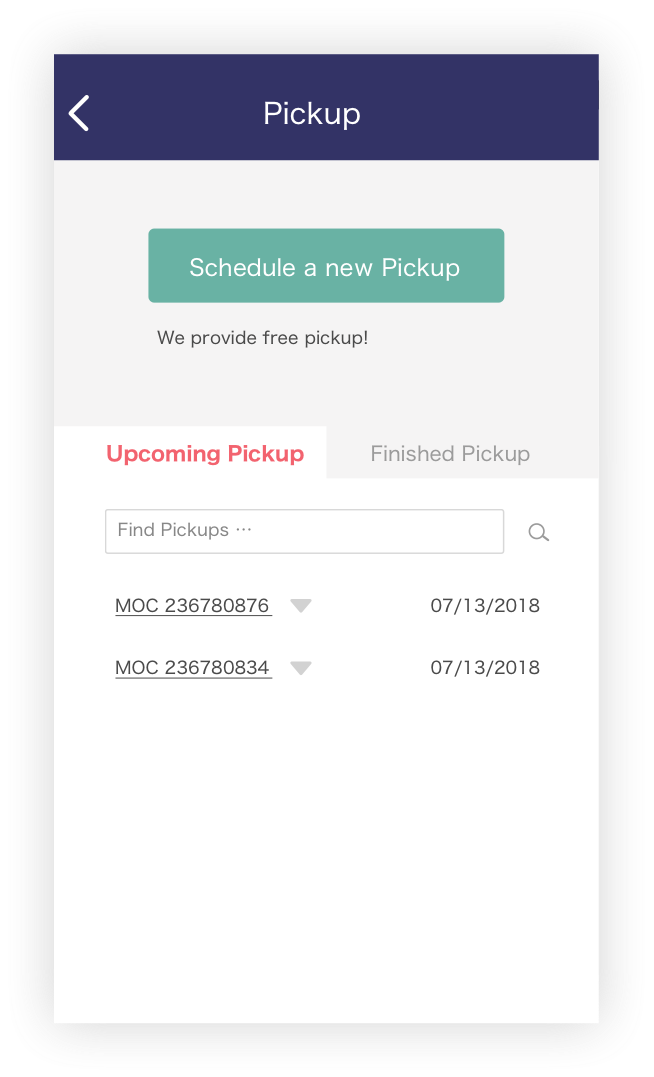
I reimagined the info structure on pickup page. Add function allows users to check the status of their upcoming pickup and finished pickup.


From this case study, I noticed that the mobile app has a higher standard of user experience. It’s a device that has the most time spending based on multiple research measures.
The original design of USPS Mobile App depends on their websites more than its own information architecture. It's more like a micro vision of sites. But it lacks real-world user research.
Though these three tasks were made without access to any internal information, it could have potential issues. But it has shown my idea of the reconstruction of information architecture and visual design direction.